So! The Thrilling Adventure Hour Graphic Novel is now available at your local comic book shop. It features 16 full color pages illustrated by yours truly. So far it's been very well received by critics and fans. As I understand it, the first print run is sold out— scooped up by distributers. So get one while you can! Click here for further information
Hello there! Seeing as it's been almost six months since my last web log post I thought you might like to know what I've been up to. Would you? I'm going to assume the answer is yes— or at least "sorta."
In addition to working at Laika Inc. on their upcoming movie, The Boxtrolls, I'm tickled pink to report I have a contribution to the upcoming Thrilling Adventure Hour Graphic Novel. If you're not familiar with the Thrilling Adventure Hour, it's a live show and podcast created by the brilliant writing duo, Ben Acker and Ben Blacker. The show has been running since 2005 and features a variety of original segments performed in the style of old time radio plays. Now the Bens have taken the next step and created a series of short stories featuring their beloved characters in a new graphic novel from Archaia Entertainment.
The book makes it's debut this week at Comic Con so please stop by and check it out if you're out there. Here are some raves, previews and ordering information for the book: Click it!
I illustrated the Jefferson Reid: Ace American segment and I'm really pleased with how it came out. I'll share some more art from the book sometime in the future but for now here's an older unpublished piece I did inspired by the Jefferson Reid characters. Don't miss it y'all! Thanks always for checking in!
Here are a few images I made while working on a pitch for a Cap'N Crunch commercial. It's the first time I've drawn a corporate mascot. If you're not familiar with the history of Cap'N Crunch's likeness, a quick search on google images is well worth a look. He was steadily transformed from an endearing elderly cartoon cereal spokesman (by Jay Ward studios) to a corporate focus group nightmare. He's a strange fellow. I was trying to create a character that looked like a traditional cartoon. Here are some samples of drawings I made of the Cap'N.
His Ship.
The concept was based on an older more disheveled Cap'N. These next couple drawings take the idea a bit too far.
His faithful sidekick, Sea Dog. He has a great twitter account
This was the final series of head shots for the pitch.
So first and foremost if you haven't seen "Scary Smash" yet click here.
I thought it would be fun to show a few bits and pieces of the process behind the animation and other elements that went into Scary Smash. I worked very closely with the director, my friend, Daniel Strange, throughout the process. Dan had followed a series of illustrations I made of Santa Claus last year and was interested in creating animation that would create a similarly unique blend of line and texture. Dan had a definite vision and was quickly sending me some ideas for what those textures would be. This direction worked out well, since I had been collecting and creating my own textures for years now. This look did derail one aspect of animating Scary Smash though— it wasn't going to be practical to animate it in Flash. The textures made it far too difficult. It was going to have to be hand drawn and colored in Photoshop. This approach would look as if the monster were cut out of felt. It looked great but it was laborious.
All of the frames in Scary Smash started as a black white ink drawing.
After scanning in all the drawings, I arranged them in layers in Photoshop, then I would use a series of action scripts to paste in various textures. After dropping each texture I would move it to a slightly different location so that the texture wouldn't remain static behind the drawing. This creates the grainy fluttering effect you see when the monster is on screen.
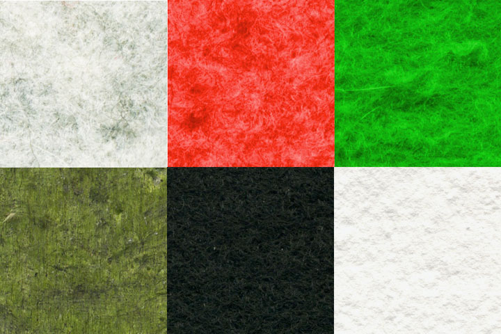
Some sample textures.
The first multi-eyed monster to appear (whom we affectionately named "Hundo") was easily the most challenging to create and color. I wound up creating each frame in three layers— the front set of eyes, then Hundo's tentacles, then the back set of eyes. This meant I could loop the back set of eyes and allow the tentacles to move over top of them at a slightly longer loop, then I could animate the dozens of other eyes and the mouth as needed. I thought it would be funny if just one set of eyes had an angry expression.
Each frame was saved as a series of transparent tiffs which Dan would drop in with Adobe After Effects.
The fire and water effects were some of my favorite parts of the project.
I created a shot of fire that the monster spits out (Dan wound up utilizing it for some of the guns as well). This was actually all hand drawn. I drew the frames of the fire in yellow, red and black ink side by side on a few sheets of bristol.
Each frame of the water started as a high contrast black and white drawing created with a brush and a sponge. I then pasted a series of colored sponge textures I had created and added some finishing touches using custom brushes in Photoshop. So basically each frame is hand painted (Dan was the stand in for this sequence while I worked on the animation— the shot with Mr. Whedon hadn't occurred yet).
Example of one of the sponge textures used for the water effect.
Once I finished animating the monster I was very excited to get to help out with some background imagery as well. These were created in the same manner as the monster but with different textures— some hand drawn and some from physical objects that I scanned in.
I've always been a huge fan of Looney Tunes and in particular their amazing background paintings. I was definitely thinking of them when I made some of these background elements.
Dan created the fields of fire that appear in several shots. These were some extra set-pieces to make it look as if the whole town was fire. These were ink drawings colored in Photoshop with custom brushes.
At one point Dan and I were going to have an anime inspired death frame when the monster got stabbed. It would have been fun but it wound up not working out. This was pen and ink and, again, digitally colored.
Here are some early sketches of the monsters. I always start out trying to make a drawing funny, then I work at making it look presentable. Sometimes a polished drawing loses its charm. I was trying to make it look as if I really don't care what the drawing looks like.
Some early versions of "Hundo."
An early version of the one-eyed monster.
Big thanks to Daniel Strange for doing such a great job putting everything together. Thanks to you for reading! If you haven't seen it yet, there's a great series of making of videos on youtube as well. I make an appearance in a few of them.